
Signage discussion


Well we need some diversity in the signs, otherwise it would become boring seeing the same sign in all of Europe 
Founder of Project Balkans (formerly known as Slovenia map project)
Our thread
My Youtube channel
Facebook page
For more info, please PM me!
Our thread
My Youtube channel
Facebook page
For more info, please PM me!

I am looking forward to this map  Even if, honestly, it is not as good as SCS or Promods maps, I like your work a lot because when I opened the editor for the first time.. well, no comment
  Now, I can make simple landscape and junctions, but it is still very hard for me.
Especially Austria looks nice, keep it up!
Btw, my favourite signs are Czech they are simple, but they have everything you need

Especially Austria looks nice, keep it up!
Btw, my favourite signs are Czech


Actually, I prefer the new style more. Considering it copies a lot of elements from the German signage, I'm all for uniformity in the EU.MandelSoft wrote:Especially compared to my top 3 signage systems of Europe, a lot can be improved.
#3: The Netherlands, Old School
I agree, but sorry, I find the topic too interesting not to reply on it. I'd like to suggest splitting of the foreign-sign discussion into a new topic, so the Slovenia topic can stay clean while we can continue the signage discussionvolan123 wrote:From now on, back on topic!
I also prefer the new style of Nederlands signage. Also, I didn't want to say that Austrian signage is in the top, but I compared it with Italy and other Balkan countries 
Founder of Project Balkans (formerly known as Slovenia map project)
Our thread
My Youtube channel
Facebook page
For more info, please PM me!
Our thread
My Youtube channel
Facebook page
For more info, please PM me!
-
MandelSoft

- Lead Developer
- Posts: 3835
- Joined: 08 Aug 2013 10:48
- Location: Delft [NL]
Well, I would like the new signage system of the Netherlands if it were executed well. Unfortunately, this differs quite a lot. There are regions where the standard is really good (Noord-Holland), but I find more situations where it is executed badly (Eindhoven, for instance). It just feels like the German system, but executed with way less quality and consistency...
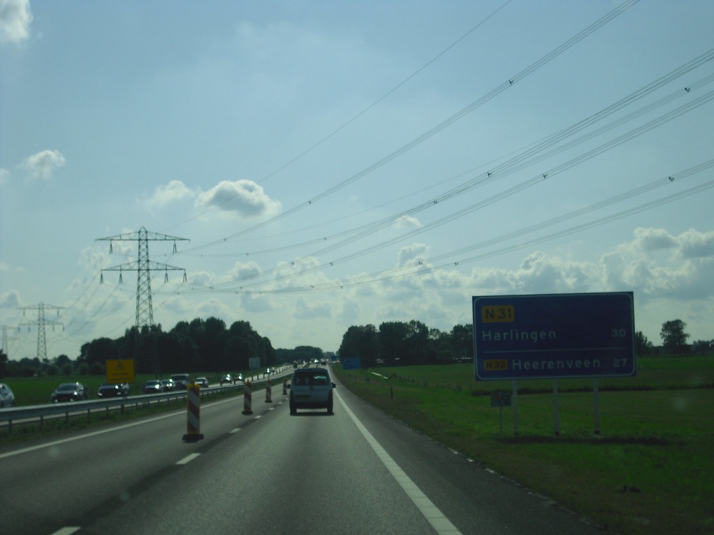
My biggest pet peeve: floating route shields. It's a case of inefficient and poor alignment. In the northern parts Rotterdam and in Noord-Holland, you don't see that thankfully, and there you have the proper alignment with the baseline, like in this example:
 Untitled by Wegenrein, on Flickr
However, I often see the route numbers placed like this:
 2014-08-31 17.53.47 by fred3324, on Flickr
Here they are aligned to... yeah, what exactly? It just looks bad, it seems that the center of the route shields is aligned to the top of the arrows, which is completely nonsensical and takes up more vertical space (= more costs for the sign and extra wind loads). Why do they keep on doing that? It's such a pity...
Another pet peeve: I'd prefer to see the route number centered here instead of aligned to the left:
The old system was way more consistent in style and alignment. That is something I like to see. Also due to its simplicity, I value it more than the new system. If only they solved the problems with the current system, then it would be great!
Best,
MandelSoft
My biggest pet peeve: floating route shields. It's a case of inefficient and poor alignment. In the northern parts Rotterdam and in Noord-Holland, you don't see that thankfully, and there you have the proper alignment with the baseline, like in this example:
Untitled by Wegenrein, on FlickrHowever, I often see the route numbers placed like this:
2014-08-31 17.53.47 by fred3324, on FlickrHere they are aligned to... yeah, what exactly? It just looks bad, it seems that the center of the route shields is aligned to the top of the arrows, which is completely nonsensical and takes up more vertical space (= more costs for the sign and extra wind loads). Why do they keep on doing that? It's such a pity...
Another pet peeve: I'd prefer to see the route number centered here instead of aligned to the left:
The old system was way more consistent in style and alignment. That is something I like to see. Also due to its simplicity, I value it more than the new system. If only they solved the problems with the current system, then it would be great!
Best,
MandelSoft
Your daily dose of wisdom!
╔═══╗────╔═╗╔═╗────╔╗
║╔═╗║────║║╚╝║║────║║
║╚═╝╠═╦══╣╔╗╔╗╠══╦═╝╠══╗
║╔══╣╔╣╔╗║║║║║║╔╗║╔╗║══╣
║║──║║║╚╝║║║║║║╚╝║╚╝╠══║
╚╝──╚╝╚══╩╝╚╝╚╩══╩══╩══╝
Don't ask us for a release date; we don't know either.
╔═══╗────╔═╗╔═╗────╔╗
║╔═╗║────║║╚╝║║────║║
║╚═╝╠═╦══╣╔╗╔╗╠══╦═╝╠══╗
║╔══╣╔╣╔╗║║║║║║╔╗║╔╗║══╣
║║──║║║╚╝║║║║║║╚╝║╚╝╠══║
╚╝──╚╝╚══╩╝╚╝╚╩══╩══╩══╝
Don't ask us for a release date; we don't know either.
So do you know any other bad signages that other countries use? My worst IMO would be Italian, since it's not always consistent and they put way too much info on a little boards:

Founder of Project Balkans (formerly known as Slovenia map project)
Our thread
My Youtube channel
Facebook page
For more info, please PM me!
Our thread
My Youtube channel
Facebook page
For more info, please PM me!
-
MandelSoft
- Lead Developer
- Posts: 3835
- Joined: 08 Aug 2013 10:48
- Location: Delft [NL]
Oh, I can open a whole can of worms about Italian signage. It's in my opinion the worst system:
- Overall bulky appearance
- Changing font sizes
- Ugly fonts. They use two different ones.
- Overall inefficient sign layout.
- Destination choice is inconsistent.
- Route shields not consistently displayed.
- Arrows don't match lane setup quite often, especially the upward ones
- Downward arrows are not above their respective lanes
- Sometimes the signs have a strange logic, especially in distances. On minor roads, you can see distance markers to certain locations, but it's not the distance to the city, but the road that leads to that city. Very confusing.
- Too many colours on secondary road signs.
- Sometimes way too many destinations
So that's why I consider Italian signage to be the worst of Europe.
Best,
MandelSoft
Your daily dose of wisdom!
╔═══╗────╔═╗╔═╗────╔╗
║╔═╗║────║║╚╝║║────║║
║╚═╝╠═╦══╣╔╗╔╗╠══╦═╝╠══╗
║╔══╣╔╣╔╗║║║║║║╔╗║╔╗║══╣
║║──║║║╚╝║║║║║║╚╝║╚╝╠══║
╚╝──╚╝╚══╩╝╚╝╚╩══╩══╩══╝
Don't ask us for a release date; we don't know either.
╔═══╗────╔═╗╔═╗────╔╗
║╔═╗║────║║╚╝║║────║║
║╚═╝╠═╦══╣╔╗╔╗╠══╦═╝╠══╗
║╔══╣╔╣╔╗║║║║║║╔╗║╔╗║══╣
║║──║║║╚╝║║║║║║╚╝║╚╝╠══║
╚╝──╚╝╚══╩╝╚╝╚╩══╩══╩══╝
Don't ask us for a release date; we don't know either.
Totally agree with all the points you made Recently I fell in love with Polish signage, it looks so nice and organized. It's not as good as Germans signs, but for Eastern /Central Europe is good enough

Founder of Project Balkans (formerly known as Slovenia map project)
Our thread
My Youtube channel
Facebook page
For more info, please PM me!
Our thread
My Youtube channel
Facebook page
For more info, please PM me!
-
darthstingy123

- Posts: 10
- Joined: 22 Jan 2014 19:39
- Donation rank:

- Location: Peterborough, England
Hi, I have managed to change the UK A road designation font from Motorway to Transport if it is any help to anyone
So basically from this:

To this:

I don't know if you has already done this but I got tired of Motorway on the wrong signs, I also changed the A road map icons to transport.
I am happy to share the files if anyone is interested
So basically from this:
To this:
I don't know if you has already done this but I got tired of Motorway on the wrong signs, I also changed the A road map icons to transport.
I am happy to share the files if anyone is interested
Hmm, what is your (the sign expertMandelSoft wrote:Oh, I can open a whole can of worms about Italian signage. It's in my opinion the worst system:
My favorite signs are those of Denmark. They are beautiful, logic and fits perfectly into the landscape! (In terms of colors and design)
-
- Information
-
Who is online
Users browsing this forum: No registered users and 14 guests